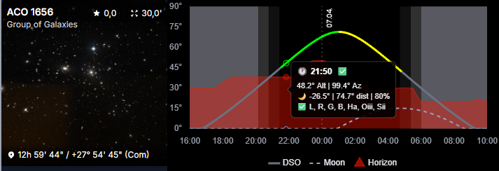
Altitude Chart
The Altitude Chart shows how a target behaves across the night from the selected observatory.
It helps answer practical planning questions:
- when does the target become usable?
- when is it highest?
- how long does it stay worth imaging?
Color Coding
The DSO curve uses color to show how usable the target is at a given time:
Green: all configured filters are usableYellow: at least one configured filter is usableRed: none of the configured filters are usable
The red area in the chart background represents the observatory horizon.
This filter-dependent behavior is influenced by your moon-avoidance rules.
Configure those rules in Moon Avoidance.
Tooltip
The tooltip gives you the exact values for the point you are hovering.
That makes it much easier to inspect the target's altitude at a specific time instead of only estimating it visually from the curve.
Why Observatory Accuracy Matters
The chart is only as good as the observatory data behind it.
For the most realistic results, configure your observatory carefully, especially:
- coordinates
- timezone
- local horizon
Where You See It
The Altitude Chart appears in multiple AstroManager areas, especially:
- Deep Sky Object details
- Bookmarks
- Targets
- some mosaic-related views